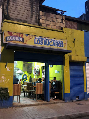
We were tasked with making multiple point perspective shots in a city, which led me to immediately think of Medellin's Comuna 13- a neighborhood known for being the most dangerous place in the entire city. Over time, a citizen outreach and revitalization program turned the place around and it's become something of an art capital in Antioquia. The buildings there are all squat and boxy, which is perfect for showing off perspective. Another thing that I found fun was that Medellin, and Colombia as a whole, is very hilly and as such our cities have a sort of verticality that gives them a distinct personality, and for the sake of this assignment it gives me an opportunity to make a visually appealing piece.
Planning out the piece took me a while. I grabbed as many reference pictures as I could, and sifted through them to get the look and feel of these buildings down. I wasn't going to be able to be faithful to the architecture, but I wanted to capture at least some semblance of the style.
A chaotic street corner, packed with a mixture of dwellings and stores, seemed to me like the best route to take this. This seemed to me to display the quintessential quality of a city- everything is at your fingertips, everything is stacked and mushed together, and buildings go tall instead of wide.
Once I had a basic layout in mind, beginning in Maya was very easy. Having an outline planned out made blocking out the buildings simple, and I was able to focus on things like scale, building diversity, and how well everything would fit with each other.
Once everything was blocked out, I began to model each building separate from the layout. The intent was to have the building in a position to make modeling and assembly easy, and then rotate and translate them as they needed when that step was done.
I developed a modular asset system where I would take a building and outfit it with any decoration and trimming it needed as well as model it to better suit the environment.
Finally, I began to render out the passes. 1 point perspective, 2 point perspective, and 3 point. Our final task was to take one of these and push it farther, so I chose the 2 point perspective and took it to photoshop.
This was the final step in the little corner's journey to this blog. I chose a film noir look for this shot because to me, these buildings feel old and bring me nostalgic feelings. Seeing them again through film grain as if it were a black and white picture was evocative to me, and I hope pleasing to you. Thank you for reading!


No comments:
Post a Comment