Labels

Monday, August 2, 2021

Saint Anatoles Cathedral (3D Art Week 03)


Research Project: Trim Sheets

 So this semester I said I was going to hyperfocus on one technical aspect of the job, and that's trim sheets for me. Trim sheets are an essential part of the environmental artist's toolkit; you'll be expected to make a bunch of assets quickly to the point where you can't texture everything individually, there's just not enough time. You will also be asked to make large swathes of architecture, and this is where these little guys come in. So where you'd typically need at least a couple materials for an environment, you can accomplish the same with just one, saving on space and drawcall power when it's time to package your game. 

WHAT IS A TRIM SHEET?

This is what a trim sheet looks like: 


Essentially, you'll have a variety of horizontal strips, each bearing a specific texture. When you go to texture your objects, simply UV them into strips and lay them out on top of this texture according to whatever texture you would like the objects to have. Because of the way UV space works, if your UV shell stretches out beyond the actual udim, so long as it's a horizontal stretch, it will continue to retain the texture. Trim textures run infinitely off to either side, so take advantage of that with your assets and UVing. This is the true strength of trim sheets, and the reason they're used to texture large areas and buildings, because they can cover a large area quickly and retain a good resolution while doing it. 

Here's an example of how this trim sheet was used. Notice how the environment has a consistent look to it, and all the wood seems to come from the same place? 


Trim sheets are super powerful and if you make them right, you can theoretically cover an immense amount of ground with just a single one. However, they require a lot of planning and technical knowledge to pull off.

HOW DO I PLAN A TRIM SHEET?

The first thing you have to do is figure out how big you want your sheet to be. Usually you'd go about it by your texel density, which governs how packed your resolution will be. I typically make 2048 resolution trim sheets, which cover about 4 meters of geometry. The texel density for these sheets is .512, which is the industry standard and used in games like Uncharted and God of War. 

So, knowing you have 4 meters squared to work with (4 down and 4 over), what are you going to have on your trim? This is the time to take out your reference and your untextured proxy shapes and mess around to see what you come up with, what shapes you want to bring to the textures and what designs you'd like to focus on. I'll be using my pirate ship trim for this example:


In this concept sketch, I planned out some support pillars, a network of ceiling beams, and a complex wall arrangement of wooden plans with a thick beam running down the middle and inlaid panels at the bottom. This was a relatively easy and simple trim sheet since most of the elements were arranged in order on the wall itself, so it was easy to visualize how it would end up looking. If you scroll up and check out the trim sheet, you'll notice it looks pretty much like a chunk of wall, and that's because that's basically what a trim sheet is. 


Once I knew what I wanted, all I had to do was plan out what I needed and grant each texture a proportional space in my sheet. If you plan out your trim in the sense that you have a measured ratio (1 meter strips, half meter strips, etc) then you’ll be able to plan out game assets better and if there are any variances in your sizes, you can squash and stretch the geometry or the UVs to fit the trim sheet. 

MAKING THE TRIM SHEET

So this is the part where we open up Maya and try to fit our ideas into a real 3d space, which generally involves some fiddling about. You should be able to have a basic layout done though, since if you're making a 4x4 sheet all you need to do is make a plane at that size, and add divisions to denote the different textures you planned out. 


So the first thing to do is slap a reference object in there to make sure your scaling is correct, and once you're confident that it is, begin extruding and forming the basis of your trim textures. We're going to be following a standard high poly to game res workflow, except instead of a game res model you'll bake over, we'll simply bake on a subdivided plane; the very same one you should have right now. Duplicate that, and extrude out the shapes on the copy, that way you'll have your game res already made.

The reason why I emphasize subdivided is because you'll want to make each strip a separate object. That way, when you get to Substance Painter, you can easily mask out areas based by mesh, but most importantly, bake things correctly. For example, the top strip could be Trim_Sheet_Wooden_Planks_Low, and you'd have a corresponding high res piece to bake on it. Understanding the baking process and how information maps are generated is an essential part of trim sheets. I'll explain some common pitfalls later, but for now continue making the sheet.

For any horizontal tiling, you don’t need end caps so you can delete those. Anything that isn’t tiling will need end caps though. Once you've gotten all your detail in, you've got to prepare the trim sheet high res for importing to ZBrush, and having it survive the process of dynameshing. Typically you want to add supporting edges so that your shapes don't shrink or subdivide weirdly (like a rectangle turning into an oval), but this also means extruding the back of the trim sheet out to form an enclosed mesh. 

I'll demonstrate what this means. Here is another trim sheet I made. Notice how the back is empty, as in there are no back faces?


This is fine for a game res, but not for a zbrush import. As soon as you hit dynamesh, the wall will attempt to close itself off and it'll have weird geometry on top of deforming unpredictably, and being too thin for certain operations. I made this mistake with my first trim sheet and it made sculpting really hard because of the way my geometry was affected, it made a massive seam on the edges when it came time to bake. 

SCULPTING IN ZBRUSH

When you bring the trim into Zbrush, be sure that each element is a separate subtool for easier subdivision and sculpting. Subdivide each piece of the trim so that it has roughly 1 to 2 million polys. That should give you enough geo to get things detailed. Subdivide with “smooth” turned off, and then after a couple tries, turn smoothing back on and subdivide again. If there are any curved pieces, subdivide in Maya and get it nice and populated before importing to zbrush because the process outlined above (subdivide without smooth a couple times and then with smooth) will cause it to warp.
For the big panels and other trims that don’t tile, just sculpt as normal. However, for everything else, you’ll need to modify your brush to tile. Basically think about it this way: you're looking at a flat cylinder. The left edge of your trim sheet should be able to seamlessly transition into your right side. If that doesn't happen, or if there's a seam, the repetition and tiling of the trim sheet will be disrupted and there'd be no point to making a trim sheet in the first place. Therefore, you make your brushes tileable to avoid this. 

WARNING: You’ll have to do this for every brush!

BRUSH MODIFICATION: Brush>Curve>WrapMode: turn to 1. This will make your brush strokes go from one edge of the sheet to the other, retaining positional data so you can then go back and continue the stroke to give the illusion of a tileable texture. 

For the first pass, get the basic shapes of each piece down. Then, add more detail as you go on. Make sure that none of it is super apparent when you’re tiling it, otherwise it ruins the effect of the trim sheet. This means no unique damage, nothing too flashy or attention-grabbing because otherwise, you'll be seeing that very distinct piece tile over and over and it'll be obvious you're repeating a pattern. 

Use the layers function in your workflow! It's a nondestructive way of adding detail and experimenting with it. You don't have to commit to any changes, and can slide the tolerance around to smooth out or intensify whatever you did. 

One last piece of advice is that if your tiling is weird with these textures/brushes, test it out in Maya and see where the issue is. If it needs to be fixed, don’t worry about doing so in Zbrush but instead take it to Photoshop and spot heal it out. Another thing that you could do is fade the ends with a smooth brush to hide the detail and “magically” add wear detail so it tiles better.

BAKING YOUR TRIM SHEET

Turn on your oven to 350 degrees. Import in all your pieces from Zbrush, rename them to highs and lows in accordance to your game res piece, and then prep the pieces for baking. Since this is a tiling texture, it's not as simple as just exporting it out and baking. Depending on where you want your AO and curvature maps, you may need to do the following:


The center piece is the original trim sheet, but since I want there to be AO info on the sides of these tiles, I have to put geometry on either side and the top. That way, when this high res is baked, the trim sheet will act as if it were truly tiling, but we're just tricking the program into including that tiling info for us. One last thing to keep in mind is that it is absolutely necessary to know if the UVs for the top of the geometry correspond to the top of the UVs, otherwise your texture will render weird. 

Be sure to unfold your game res piece! There's nothing more heartbreaking that texturing a whole trim sheet and realizing your UVs are scuffed. Make sure to check everything twice before you do it, and understand what you want and need during the planning process so you don't have to redo it!

A FEW BAKING TIPS

Keep in mind your Max Frontal Distance and Max Rear Distance when baking and it’ll save you a lot of time. For example, I typically put .07 or .1 as my values for those settings when dealing with trim sheets since you're baking a lot of tridimensional detail on a flat plane. 

In order to test out your trim sheet, duplicate your game res on either side of the original, and reimport to see if it tiles in Substance: 


And finally, zoom out every so often and check to see how your textures look! Sometimes we spend so much time texturing in little details that never matter, or we make mistakes, etc. Always check your work!

THE FUN PART

I'm kidding, naturally. This isn't fun at all as it involves everyone's least favorite part of 3d, UVing. In this step, you're gonna take the textures you exported from Painter and slap them on your assets in Maya. I'll demonstrate with the pirate ship once again. 


Here is a shot of a properly UV'd asset. It uses three of the trim strips, which I'll show below. I decided to make a lambert and put the normal map of the Painter textures in there so I could have a visual reference of what I was doing. Once that was done, I then had to slice the geometry and cut UVs to overlay on top of the trim sheet itself. 


This is the trim sheet itself, provided thanks to the lambert I put on that windowed wall. All I had to do after that was unfold the UVs and play around with them until I got them to tile and look good. It sounds complex but it's very intuitive, and other than the actual UVing process it's quite fun to see your textures pop up on screen!

With that being done for all your assets, you're good to go! As long as the UV position of these assets doesn't change in relation to the trim sheet they're using, the textures should hold and show up perfectly in Unreal. Using this method, you can make modular textures and dynamically change colors, details, etc on entire rooms and even buildings. There's no limit to the amount of things you can do with a solid foundation in trim sheets and a good understanding of the technique. 

And that's pretty much it for me! Thanks for reading all this, and if you want to know more, here are some resources that might do a better job than I at explaining the process:

https://www.youtube.com/watch?v=uUJShalzWy8

https://www.youtube.com/watch?v=DipfrjCgYW8&t=0s


Sunday, July 25, 2021

Saint Anatoles Cathedral (3D Art Week 02)

 So after taking an extended look at the cathedral and messing around in Maya, I've come up with a gameplan that will hopefully work out in the end. This week I don't have much to show, but I will walk you through my thought process and see how I've been making the cathedral modular. 

The nave walls are complete, and they're in game res as well. The pillars can be reduced further but that's something for later. I have yet to make the triforium (2nd floor) and fill out the vaulting in the clerestory (3rd floor), but those are a bit more complex and right now I just wanted to get the right dimensions and have everything looking good for the next step: the vaulting. 

The complex parts about Gothic cathedrals isn't their arches or their pillars, but the vaulted ceilings they employ to alleviate stress and weight from the top and spread it out to the piers (pillars) below. They have a weird pattern to them as they have to not only match the arching next to them, but fit seamlessly and have an apex point connecting the structure. Another consideration is that they have to tile seamlessly and match. It all sounds pretty complex but if you turn your brain off and use curves+revolve in Maya, it's not that hard. However, there are three types of vaults in this cathedral. I've been able to complete the first floor and get it to you in engine, but I'll be doing the other two and fill out the parts I mentioned earlier, the clerestory and triforium, as soon as I finish this post. Once those are done and in engine, it should be easy to then make the altar since it's just a bunch of boxes... in theory. 

The point is that most of the big shapes are there, and the architecture is pretty solid. Next week I'll finish up what little is left and then begin generating trim sheets. I decided that I would make two, one for masonry and wood, and the other for the altar and its intricate detail. The fourth week will be spent texturing the trim sheets, cleaning up the scene, and making the unique pieces like the confessional and the balcony both on the side. 

I'm not gonna lie, it's definitely not going to be finished by the time this semester ends; I chose a project that was very big and since I'm always slow to start, it took a little longer to get in the rhythm of things. I doubt it'll take an exaggerated amount of time to finish, perhaps a week and a half, but I do want to forewarn that it won't be at the level of my previous pieces (which are also unfinished in their own ways).


Friday, July 23, 2021

Final Sprint Delivery (VR)

 We've reached the end of our sprints, and from here on out we're polishing and fixing up stuff. For this sprint I did a good amount to make up for some stuff I was behind on, and completed a couple other extra things. For this sprint I handled foliage almost exclusively- in the screenshots below you can see all the plant life that was added to fill up the play space. I positioned it so that it was more recognizable and closer to the movie, and then I messed around with the materials to get a good color going. Once that was done, I was getting some extra shadow information I didn't want, so I decided to "paint" with lighting- a couple very low intensity lights set in a channel analogous to the bushes kept them illuminated and looking healthy while the rest of the scene went untouched by those lights.

Since I was already messing with lighting, I decided to tweak the values and positions of a couple of our lights to bring out the color saturation of the scene a bit more. I also adjusted the skybox so the light coming from it made the sky resemble the last vestiges of a sunset, and tuned down the moonlight to get rid of overly shiny/washed out surfaces. I also turned up the firelight so that it was warmer and reached farther, making the scene feel a bit cozier and more intimate. 

The last changes I had to do were to add flowers and cattails, the last of the vegetation I needed to get through. I gave them a wind node and played around with some colors, but made them small and placed them sparsely to avoid overpopulating the scene. I have a mind to make some color variants for the flowers, but that can come later. 


And that's it! Hope you've liked seeing our project evolve into what it is now!


Sunday, July 18, 2021

Saint Anatoles Cathedral (3D Art Week 01)

 Alright kids, the time has come for my last project in existence. After this, I'll retire and go raise crickets or something. I decided to do something very complex and realistic to boot, so future David will be very disappointed and salty with me. For now, though, that's future me's problem so who cares? I want to further delve into the power of trim sheets and understand what it takes to completely deconstruct an environment, and then make it in as short a time as possible with modular and duplicated assets. I'll be using as many tricks as possible this time to aid me since... this really is a big boy. 


This is a piece by the wildly talented Will Burns, who is now working for Blue Mammoth. This cathedral was supposed to be a location in the now cancelled World of Darkness MMO. I contacted him and made sure to get permission for its usage, and since it's part of a cancelled game and it's been quite some time since the piece was posted, we got the green light to go ahead. This is a super demanding piece so I'm very much looking forward to seeing what I can do to impress Mr Burns!


My preproduction process has been refined since the last project. This time I started with some blockouts to understand how many unique pieces there are in the scene. Oftentimes you'll be able to get away with a ton of duplication and repetition, so recognizing these patterns helps you save time and effort, but also produce fewer assets with which to make your piece. Once this blockout was done, I sketched up a quick trim sheet layout and thought about what materials I would like to replicate a ton. Some materials are worth putting on a trim sheet and some aren't. For example, the sculpted parts of the altar could technically be a trim sheet, but it would be awkward and janky and it's just easier to do it uniquely and get it over with for time constrains. 


I decided on these materials to represent in my trimsheet: 
1. Brick pattern for walls
2. Big, flat bricks for arches
3. Dark border trimming to split wall regions
4. Sculpted relief borders to top pillars
5. Big rounded bricks for pillars
6. Pew Wood

Most of the materials on this trim sheet are for stone and the masonry on the walls, etc. By making an opening for the pew's wood, I can reduce the amount of effort I put into those pews. They're actually pretty excellent in terms of trim sheet usage since they're a solid slab of wood, straight planks slapped horizontally with simplicity as their driving theme. Sure, I might need to uniquely sculpt some of the weird siding and whatever footrest mechanism they might have (did they have those in medieval times, or were they just a solid block?), but that's completely worth it. Imagine having to uniquely sculpt what, 6 different surfaces and make it look like fine wood grain. Gross, and I love sculpting wood lmao. 


My last bit of notes was this jumbled garbage. It's my attempt to understand how the unique pieces of this cathedral work in their spatial relationships with each other, and compositionally. For example, the balcony booth thingy on the left side of the reference (highlighted red on my blockout) can be broken down into a series of duplicated panels, hides, and a top and bottom part. Definitely better than modeling the whole thing and trying to make it work. Instead, I've made it modular and can do it in a shorter amount of time. 

The altar is another beast altogether. It's massive, full of fine sculpted detail, and complex to boot in a structural sense. I decided to break it down into blocks and see how to make it modular, and I was successful to a degree. Obviously I'm going to have a ton of little pieces even if I can duplicate them, so my next idea to reduce the amount of work was to slap a trim sheet on this sucker. 

Now, I know, I know. I just said this was a waste of time earlier. What I mean though, is the bordering and the flat parts of the altar. That whole center tower can be helped a lot by a marble and golden trim sheet, and then modeling some hides and unique pieces like the cross and the giant conical roof on top. There's no helping the statues nor the disgusting amount of relief sculpture in here, but hopefully by having a second trim sheet I can alleviate myself a lot of the pains of uniquely modeling this whole thing. 


Lastly, there was a lot of research that went into this whole thing. This was actually the first thing I truly did because even though I loved art history and really enjoyed gothic architecture, that class doesn't prepare you for building one of these suckers. I gathered material on how pews look, confessionals, candelabra and chandeliers, and even the fanned vaulting that's so prominent in this piece. It's quite a marvelous pattern and I'm looking forward to cracking this puzzle open. It's a wondrous piece of architecture, really. 

The idea is that by the end, I should be able to take a camera inside this building and get it relatively close to the altar, the confessional, the pews, etc and have it look good. With that in mind, this will be the first environment I make that will be both extremely complex but also able to be seen from multiple angles (since I used a lot of trickery to get my Bamboo Temple operational)

I hope you all are as excited to see the end of this project as I am! 


Sunday, July 11, 2021

Bamboo Temple (3D Art Week 04)

 Another week, another post by yours truly. Today I come to you guys with a humble offering: My as of yet unfinished 2nd project: The Bamboo Temple of Great Mystery and Fantastic Treasure. I admit the unfinished state is due to dumb mistakes like taking too much time handpainting the skull and fiddling with texture settings, but I assure you- this attempt on my grade may have left me scarred and deformed, but my resolve has never been stronger! As such, have some images of my current progress. As always, there is much to do and more to polish, but I admit I'm quite happy with how this turned out even if it isn't anywhere close to finished.

I mentioned this before, but handpainting the skull was definitely the more time consuming part this time. Not even the sculpting process took as much time, and that's mostly because I wanted to make sure it was all perfect and matching the concept art. In the future, I will be sure to take a break and place the unfinished texture in engine to get some perspective. Some details I pored over aren't even visible, much to my chagrin, and so I'll take this lesson as it comes.

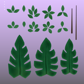
The plant matter was supremely easy to make and texture. In fact, I textured both of these in twenty minutes. Once the proxy shape was established and the assets were designed for modularity, there was no more complication to consider and the rest was a breeze. This is what they mean with hero assets being so time consuming vs the rest; the player won't be looking at each leaf, so do it quickly and tune later if needed. In this particular case, a simple mix of a base color and a multicolored Camo UCP filter gave me the texture you see. 

Lastly, I neglected to show this a week and a half ago when I made it. My foliage material has a couple interesting components that are completely tweakable. Of course, these are extremely basic functions but they allowed me to personalize the scene much more than I otherwise would've been able to. The first is a color override on the base color. I knew that the concept art had multicolored foliage, so it made more sense to make one set of foliage and recolor it here in engine instead of uploading multiple maps. The second is a very simple wind effect, which is hooked up to the World Position Offset node. I found that this method worked better for me at least in this scenario over the SimpleGrassWind node, but feel free to use either!

With that, I have to release this project and move on to the next one but I'm happy to say that it was a challenge I enjoyed entirely. This project taught me a lot and it gave me appreciation for natural and organic assets that wasn't previously there. I look forward to the next project, and to making far more vegetation and stylized environments for you to see!

Friday, July 9, 2021

Sprint Delivery 4 (VR Project) + Lighting Assignment

 For this week we were tasked with lighting another team's VR level, and my team was picked to light team 4's map. They're making an experience based on the movie Labyrinth, so I chose the throne room they'd made as I figured I could use the many candles lying around the place. I wanted to go for a much brighter ambiance than they had, with a focus on the warmer colors of the candlefire. I didn't want these lights to blow out any textures or seem too powerful, so after so messing around I managed to get a happy balance. A white spotlight resting on the throne cut across the shadows messing with it and resigning it to the gloom, and hopefully finish up this piece and assign it an object of interest for the player to focus on. 

For reference, this was the image I based my lighting on:


Also, for this sprint we managed to get plenty of things done. Our environment is mostly finished, the only places that need touching up are the foliage and some parts of the cave. The hill was textured and the seam was healed, so we were able to resolve that issue and move forward with polishing the cave. After talking to faculty, we determined that the best way to make the puddles and refuse around the edges of the cave structure was to make decals. I'm tasked with this going forward; it'll be the last polishing we do for the cave.

I textured the mosquito netting and the roots hanging from the cave walls as well, baking the latter down to cards so that they're cheaper. The mosquito netting was done with a simple alpha and is going to be edited in the upcoming days since the final look is definitely not fantastic; it merely does the job for now. 

Here are some pictures of the assets:


Tuesday, July 6, 2021

Bamboo Temple (3D Art Week 03)

 This week was intensely productive (not to pat myself in the back or anything), but we did fall short a couple ways. The foliage sheet was completed, all materials were slapped on our assets, and the entire scene was assembled! All that's left for me to do this week is get final textures out of the gate, fix up the lighting and positioning of assets, and submit for review so we can get a final polish pass on it. 

I'll take you through it bit by bit. The first step in this operation was to generate the foliage sheet. I've learned over the course of this project and the last that this is my favorite part of the process, so I did it early to make sure I could begin and keep going. Placing foliage and assets is such a brilliant feeling, it's like playing with Legos,  except you make them yourself too!


I made the foliage sheet in ZBrush, mainly. Basic shapes came from Maya, were sculpted in ZBrush, and then got baked and textured in Painter to the bits you see here. I received some feedback from an artist in the industry that you should aim to have as little empty space as possible on your foliage cards, so I tried to cut the foliage pieces out as close as I could without increasing the polycount. Deforming and bending them to resemble organic shapes was a pretty rewarding process as well. Did I mention I like foliage?

The next step was assembling the bits together, placing foliage, and getting the whole scene and ready for the final textures. This involved quick modeling a bunch of assets and baking them to get the basic textures down, and placing them in engine. Everything you see in the GIF below has been sculpted and is in game-res form except for the skull, which I'll talk about next.


You'll notice that my final frame retains the original proxy skull. That's because I was saving the worst for last, but once again this environment has surprised me. I had previously thought I was going to hate sculpting the skull and it'd be annoying; to a certain extent that was true, but I also can't deny that I enjoyed it immensely. It's been a pretty gratifying project so far and I haven't run into any snags that have sapped my willpower or anything, so I'd say it was a resounding success in terms of challenging myself. 

Anyways, this is my skull sculpt. I haven't generated a game res for it yet, but that will happen this week as well as the aforementioned final textures and lighting. 


Finally, this is what the most up to date environment looks like. I fully intend on making this look as close as possible to the reference next week in terms of values and lighting, so hang in there! We're only a couple days away from the end, so I hope you all like what I've got ready for you!


Sunday, June 27, 2021

Bamboo Temple (3D Art Week 02)

 We're a little behind this week but compared to the last project it's not as dire. All that meticulous planning pays off, kids, so stay in school and plan your stuff out. This week I completed proxies of everything and went farther ahead with some pieces as I experimented with modularity, but before I get ahead of myself I want to explain what I did at the very beginning of the week. Previously, I'd thought that I'd have to sculpt an entirely unique centerpiece for the skull to rest on, which meant that I'd have to not only sculpt the skull but also the giant trunk and all the tongues of palm fronds hanging from it. 

Definitely not an enticing prospect. 

Instead, Nick gave me some advice and told me to make each individual frond and set dress it that way. However, since we're not dummies here I made one of each variant frond I saw and then imported them into Ue4 with the intent to duplicate them: essentially giving myself a "build your own massive bamboo trunk" lego kit. Of course, this process was a bit time consuming, but ultimately it'll be super worth it as all I have to do from now on is change one texture and they all update the new changes.

Another area where we stumbled a bit and sapped a good amount of time was setting up the project in Unreal. Of course, this is something you do at the very beginning of the piece, so I was glad to get it out of the way. By overlaying Pureref with my viewport and messing with the cinematic camera's settings, I was able to get a very close replication of the concept art's perspective and focal length, which allowed me to easily set dress the scene. 

Now, I should warn you that I'll be updating this post as we speak because while the assets are made, they aren't placed. It doesn't look impressive right now but it will soon!

Saint Anatoles Cathedral (3D Art Week 03)